This manifesto was first published in 1999 in Emigre 51.
We, the undersigned, are graphic designers, art directors and visual communicators who have been raised in a world in which the techniques and apparatus of advertising have persistently been presented to us as the most lucrative, effective and desirable use of our talents. Many design teachers and mentors promote this belief; the market rewards it; a tide of books and publications reinforces it.
Encouraged in this direction, designers then apply their skill and imagination to sell dog biscuits, designer coffee, diamonds, detergents, hair gel, cigarettes, credit cards, sneakers, butt toners, light beer and heavy-duty recreational vehicles. Commercial work has always paid the bills, but many graphic designers have now let it become, in large measure, what graphic designers do. This, in turn, is how the world perceives design. The profession’s time and energy is used up manufacturing demand for things that are inessential at best.
Many of us have grown increasingly uncomfortable with this view of design. Designers who devote their efforts primarily to advertising, marketing and brand development are supporting, and implicitly endorsing, a mental environment so saturated with commercial messages that it is changing the very way citizen-consumers speak, think, feel, respond and interact. To some extent we are all helping draft a reductive and immeasurably harmful code of public discourse.
There are pursuits more worthy of our problem-solving skills. Unprecedented environmental, social and cultural crises demand our attention. Many cultural interventions, social marketing campaigns, books, magazines, exhibitions, educational tools, television programs, films, charitable causes and other information design projects urgently require our expertise and help.
We propose a reversal of priorities in favor of more useful, lasting and democratic forms of communication – a mindshift away from product marketing and toward the exploration and production of a new kind of meaning. The scope of debate is shrinking; it must expand. Consumerism is running uncontested; it must be challenged by other perspectives expressed, in part, through the visual languages and resources of design.
In 1964, 22 visual communicators signed the original call for our skills to be put to worthwhile use. With the explosive growth of global commercial culture, their message has only grown more urgent. Today, we renew their manifesto in expectation that no more decades will pass before it is taken to heart.
Jonathan Barnbrook
Nick Bell
Andrew Blauvelt
Hans Bockting
Irma Boom
Sheila Levrant de Bretteville
Max Bruinsma
Sian Cook
Linda van Deursen
Chris Dixon
William Drenttel
Gert Dumbar
Simon Esterson
Vince Frost
Ken Garland
Milton Glaser
Jessica Helfand
Steven Heller
Andrew Howard
Tibor Kalman
Jeffery Keedy
Zuzana Licko
Ellen Lupton
Katherine McCoy
Armand Mevis
J. Abbott Miller
Rick Poynor
Lucienne Roberts
Erik Spiekermann
Jan van Toorn
Teal Triggs
Rudy VanderLans
Bob Wilkinson
I may add myself to this. Federico Hernandez-Ruiz
Here’s the link to the original post: http://www.emigre.com/Editorial.php?sect=1&id=14
And a copy of the 164 manifesto written by Ken Garland along with 20 other artists.
The nutrition facts label as you know it will likely be changing soon, thanks to significant changes supported by the Obama administration:
“Our guiding principle here is very simple: that you as a parent and a consumer should be able to walk into your local grocery store, pick up an item off the shelf, and be able to tell whether it’s good for your family. So this is a big deal, and it’s going to make a big difference for families all across this country.”
– First Lady Michelle Obama
“The U.S. Food and Drug Administration today proposed to update the Nutrition Facts label for packaged foods to reflect the latest scientific information, including the link between diet and chronic diseases such as obesity and heart disease. The proposed label also would replace out-of-date serving sizes to better align with how much people really eat, and it would feature a fresh design to highlight key parts of the label such as calories and serving sizes.”
– FDA Announcement
“For 20 years consumers have come to rely on the iconic nutrition label to help them make healthier food choices. To remain relevant, the FDA’s newly proposed Nutrition Facts label incorporates the latest in nutrition science as more has been learned about the connection between what we eat and the development of serious chronic diseases impacting millions of Americans.”
— FDA Commissioner Margaret A. Hamburg, M.D.
Some of the changes to the label the FDA proposed today would:
Require information about the amount of “added sugars” in a food product. The 2010 Dietary Guidelines for Americans states that intake of added sugar is too high in the U.S. population and should be reduced. The FDA proposes to include “added sugars” on the label to help consumers know how much sugar has been added to the product.
Update serving size requirements to reflect the amounts people currently eat. What and how much people eat and drink has changed since the serving sizes were first put in place in 1994. By law, serving sizes must be based on what people actually eat, not on what people “should” be eating. Present calorie and nutrition information for the whole package of certain food products that could be consumed in one sitting.
Present “dual column” labels to indicate both “per serving” and “per package” calorie and nutrition information for larger packages that could be consumed in one sitting or multiple sittings.
Require the declaration of potassium and vitamin D, nutrients that some in the U.S. population are not getting enough of, which puts them at higher risk for chronic disease. Vitamin D is important for its role in bone health. Potassium is beneficial in lowering blood pressure. Vitamins A and C would no longer be required on the label, though manufacturers could declare them voluntarily.
Revise the Daily Values for a variety of nutrients such as sodium, dietary fiber and Vitamin D. Daily Values are used to calculate the Percent Daily Value on the label, which helps consumers understand the nutrition information in the context of a total daily diet.
While continuing to require “Total Fat,” “Saturated Fat,” and “TransFat” on the label, “Calories from Fat” would be removed because research shows the type of fat is more important than the amount.
Refresh the format to emphasize certain elements, such as calories, serving sizes and Percent Daily Value, which are important in addressing current public health problems like obesity and heart disease.
“The proposed updates reflect new dietary recommendations, consensus reports, and national survey data, such as the 2010 Dietary Guidelines for Americans, nutrient intake recommendations from the Institute of Medicine, and intake data from the National Health and Nutrition Examination Survey (NHANES). The FDA also considered extensive input and comments from a wide range of stakeholders.”
“By revamping the Nutrition Facts label, FDA wants to make it easier than ever for consumers to make better informed food choices that will support a healthy diet. To help address obesity, one of the most important public health problems facing our country, the proposed label would drive attention to calories and serving sizes.”
— Michael R. Taylor, the FDA’s deputy commissioner for foods and veterinary medicine
“The Nutrition Facts label has been required on food packages for 20 years, helping consumers better understand the nutritional value of foods so they can make healthy choices for themselves and their families. The label has not changed significantly since 2006 when information on trans fat had to be declared on the label, prompting manufacturers to reduce partially hydrogenated oils, the main source oftrans fat, in many of their products.
The changes proposed today affect all packaged foods except certain meat, poultry and processed egg products, which are regulated by the U.S. Department of Agriculture’s Food Safety and Inspection Service.
The FDA is also proposing to make corresponding updates to the Supplement Facts label on dietary supplements where applicable.
The agency is accepting public comment on the proposed changes for 90 days.”
Since 2005 startup accelerators have provided cohorts of startups with mentoring, pitch practice and product focus. However, accelerator Demo Days are a combination of the graduation ceremony and pitch contest, with the uncomfortable feel of a swimsuit competition. Other than “I’ll know it when I see it”, there’s no formal way for an investor attending Demo Day to assess project maturity or quantify risks. Other than measuring engineering progress, there’s no standard language to communicate progress.
Corporations running internal incubators face many of the same selection issues as startup investors, plus they must grapple with the issues of integrating new ideas into existing P&L-driven functions or business units.
What’s been missing for everyone is:
a common language for investors to communicate objectives to startups
a language corporate innovation groups can use to communicate to business units and finance
data that investors, accelerators and incubators can use to inform selection
While it doesn’t eliminate great investor judgment, pattern recognition skills and mentoring, we’ve developed an Investment Readiness Level tool that fills in these missing pieces.
—-
Investment Readiness Level (IRL) for Corporations and Investors
The startups in our Lean LaunchPad classes and the NSF I-Corps incubator useLaunchPad Central to collect a continuous stream of data across all the teams. Over 10 weeks each team gets out of the building talking to 100 customers to test their hypotheses across all 9 boxes in the business model canvas.
We track each team’s progress as they test their business model hypotheses. We collect the complete narrative of what they discovered talking to customers as well as aggregate interviews, hypotheses to test, invalidated hypotheses and mentor and instructor engagements. This data gives innovation managers and investors a feel for theevidence and trajectory of the cohort as a whole and a top-level view of each teams progress. The software rolls all the data into an Investment Readiness Level score.
(Take a quick read of the post on the Investment Readiness Level – it’s short. Or watch the video here.)
The Power of the Investment Readiness Level: Different Metrics for Different Industry Segments Recently we ran a Lean LaunchPad for Life Sciences class with 26 teams of clinicians and researchers at UCSF. The teams developed businesses in 4 different areas– therapeutics, diagnostics, medical devices and digital health. To understand the power of this tool, look at how the VC overseeing each market segment modified the Investment Readiness Level so that it reflected metrics relevant to their particular industry.
Medical Devices Allan May of Life Science Angels modified the standard Investment Readiness Level to include metrics that were specific for medical device startups. These included; identification of a compelling clinical need, large enough market, intellectual property, regulatory issues, and reimbursement, and whether there was a plausible exit.
In the pictures below, note that all the thermometers are visual proxies for the more detailed evaluation criteria that lie behind them.
Therapeutics Karl Handelsman of CMEA Capital modified the standard Investment Readiness Level (IRL) for teams developing therapeutics to include identifying clinical problems, and agreeing on a timeline to pre-clinical and clinical data, cost and value of data points, what quality data to deliver to a company, and building a Key Opinion Leader (KOL) network. The heart of the therapeutics IRL also required “Proof of relevance” – was there a path to revenues fully articulated, an operational plan defined. Finally, did the team understand the key therapeutic liabilities, have data proving on-target activity and evidence of a therapeutic effect.
Digital Health For teams developing Digital Health solutions, Abhas Gupta of MDV noted that the Investment Readiness Level was closest to the standard web/mobile/cloud model with the addition of reimbursement and technical validation.
Diagnostics Todd Morrill wanted teams developing Diagnostics to have a reimbursement strategy fully documented, the necessary IP in place, regulation and technical validation (clinical trial) regime understood and described and the cost structure and financing needs well documented.
For their final presentations, each team explained how they tested and validated their business model (value proposition, customer segment, channel, customer relationships, revenue, costs, activities, resources and partners.) But they also scored themselves using the Investment Readiness Level criteria for their market. After the teams reported the results of their self-evaluation, the VC’s then told them how they actually scored. We were fascinated to see that the team scores and the VC scores were almost the same.
Lessons Learned
The Investment Readiness Level provides a “how are we doing” set of metrics
It also creates a common language and metrics that investors, corporate innovation groups and entrepreneurs can share
It’s flexible enough to be modified for industry-specific business models
It’s part of a much larger suite of tools for those who manage corporate innovation, accelerators and incubators
P.S. if you want to learn more abut the IRL and other tools, we teach a 2-day class for corporate innovation, accelerators and incubators. Info here
We know that consumer purchase decisions are often made quickly and subconsciously, but there are opportunities where it’s possible to influence a consumer’s perception of a brand. People often make buying decisions by using all five of their senses and once product designers discover what each of these sensory influencers are, they can develop packaging that strategically speaks to consumers at each stage of the decision-making process. It’s ultimately about designing a complete experience–one that supports the brand every step of the way.
At my company, we developed the 4sight Sensory Lab, pictured above, to uncover these answers. Here, for example, cold beverage drinkers known to prefer their drinks not simply cold, but chilled to the perfect temperature, are taken through a progression of exercises that mimics the various points of contact that consumers have with a product.
We identify which bottle shape, size, color, material, and texture promises that sense of cold refreshment at first glance. As the test subjects move closer, details such as condensation and frost become evident and when they are handed several bottles, each chilled to the exact same temperature–but made of different materials, textures, shapes and finishes–they provide feedback on which one feels like just the right cold.
In the Sensory Lab, our process helps us ensure that at each stage of interaction with a brand, consumers receive the right information, enabling them to see, feel, hear, smell, and taste the value of the product. Here, we’ve identified the six stages that lead to a first purchase or a repeat purchase:
This is the first impression at a distance, seeing the product in someone else’s hand, on the shelf, or across the room. It’s the first visual promise of what a product will do for your senses. For Pom 100% Pomegranate Juice, the distinctive profile of the bottle featuring those fully rounded spheres, allows the distinct dark red color of the juice to catch the attention of a shopper. It promises a bold, robust taste. A new entry into the tequila segment, SX Tequila chose a distinctive, curvaceous bottle with smooth lines and frosted texture to communicate the sense of a smooth-tasting, chilled beverage.
THE INSPECTION
Here, consumers take a closer look and this is where details begin to hint at tactile sensations. Flowing details etched into the structure of the Aquafina water bottle strongly suggest the refreshment that the product provides.
Orangina, meanwhile, promises its fresh orange flavor through a dimpled finish on the bottle that suggests you are consuming straight from an actual orange.
THE PHYSICAL INTERACTION
Next, consumers make that first physical contact and combine the visual with the tactile experience. When grasped, the gentle curvature of the Febreze bottle and the angled spray head convey the soft and pleasant aroma that will fill the air. The smooth, diagonal neck on the new Miller Lite Bottle promises a refreshing flow of beer while the bold taper from the neck to the body provides a strong and confident grip for the hand. Adding the texture of the hops etched in the glass provides further engagement.
THE OPENING
When the consumer makes a physical step towards consumption or use of the product, there’s another opportunity to solidify your brand’s perception. When the foil cover is peeled off of a can of San Pellegrino, it offers the sensation of actually peeling fruit. It also incorporates a crinkling sound, which adds to the sensory experience at opening.
CONSUMPTION OR USAGE
The point at which the product is consumed or used and here, all five senses can be at play.
A smooth metal tip on Clinique’s Even Better Eyes product provides a refreshing and reviving cold sensation on the skin. For Gerber Good Start, the designated scoop holder on the side of the container provides for a clean usage experience and preserves the product for future consumption, as fingers do not contaminate the powder.
THE COMPLETION
There’s another opportunity to create a pleasant user experience when the product is disposed of or put away for later use. Wrigley 5 Gum incorporates a lock feature and embossed details to convey a secure and clean resealable pack. The Oreo cookie package also utilizes the sense of sight with a resealable film to promise lasting freshness. Once the film is replaced after each usage, it recreates the look of a fresh, unopened package.
In The Sensory Lab, we’ve gleaned significant insight into how the five senses influence consumer decision-making at six pivotal points. Incorporating a similar approach in your design process will help insure your package effectively communicates key brand attributes at each and every point of influence.
[Image: Shopping via Shutterstock]
Here is the link to the original article: http://www.fastcodesign.com/3024657/6-tips-for-making-a-powerful-first-impression?partner=newsletter
The future of branding belongs to storytellers who understand the hero’s journey in the context of modern, mobile life. The hero’s journey is a storytelling structure pervasive across cultures. It starts with a call to adventure, requires that the hero be connected to others, including a mentor. The hero will face extremely difficult challenges along the way. The hero ultimately wins and returns home, armed with new knowledge about herself, other people and the world.
Does your brand inspire people to respond to the call for adventure, whether through providing information, tools or a catalyst? Does it help them overcome the obstacles they will face on the path, either by making sure they have nourishment, transportation, tools, information or access to other people? Does it provide guidance, support, or a framework in which the story of the process, with all its ups and downs, can be documented and shared in real time? If your brand doesn’t serve any of the segments in the hero’s journey, you’re right to be concerned about the future.
Not the future of branding. Image: Flickr user Sarah Gilbert
Cecelia Wogan-Silva, the director of creative agency development at Google is tasked with growing brand advertising through Google’s platform. She accomplishes this, in large part, by inspiring thoughtful collaboration with intriguing insights and co-ideating with creative agencies at the beginning of the process instead of jumping in when distribution is the last bit of conversation left.
“We’d rather work on a cool idea together,” she said. “We try not to be product focused. Instead, we’re problem-focused. Working up a solution that’s only inclusive of what we do at Google is like dropping feta cheese off at the door of someone who doesn’t know they’re sitting on an entire Greek salad. We help them manifest the big idea that brings the salad together. We are in the business of sales but we don’t start with a pitch. we start with a conversation. We try to develop story engines. We ask: What story are you trying to tell? We want to launch a thousand ships together.”
The perceived need to master emerging technologies and engineer a viral video dominates much of the conversation in the world of branding. Clients want measurable proof of eyeballs on the screen, and creatives struggle with the expectation that they’ll be able to engineer a hit. But what is a hit? The trend toward the mean-spirited shock video filled with actors faking real-time reactions to disgusting pranks is the result of the mistaken belief that eyeballs equal success. This mentality is largely a relic of the measurement of success in television advertising, which isn’t surprising. The history of the advertising industry, Wogan-Silva said, is a string of attempts to reincarnate what came before in a new medium.
“The poster in the window got smaller as a print ad,” she said. “But it was just like the poster in the window. Then print ads got read on the radio. Then the concept transported itself to TV in the beginning with still pictures added to what were essentially radio spots. In each instance, advertisers didn’t take advantage to the fullest of the new medium. Our habit is to stick to legacy. Radio was a new technology. So was TV. The exponential release of new technology doesn’t change the need for percolation in the creative process.”
“There’s this automatic inclination to believe that new technology is creativity’s silver bullet. But invention of technology is different than innovative use of existing things. Great TV wasn’t born from the new platform from the get go. But the stories got better, the use of bookends in commercial buying was a new variation that came from careful, deeper consideration for what could be done with this amazing medium.
“The same is true for using digital platforms. Brand marketers waiting for the latest product to be the first to use it might miss the chance to do something extraordinary with what we already have before us. Something extraordinary is usually something that touches consumers and tells a story, it’s not just technology alone that builds a brand.”
Wogan-Silva believes that the concept of being a slave to the latest technology fad or ad unit will become a thing of the past.
“Instead, there’s value exchange brought to you by a brand,” she said. “What does that look like? Uber.” Google is an investor in Uber, an “app that connects you with a driver at the touch of a button.” Transportation is a natural part of your life experience, Wogan-Silva said. Brands that are focused on getting us places and connecting us to others, essentially offering sustenance, transportation and intelligence, are the brands of the future. Uber is welcomed, rather than invasive. “My sense of what a brand can do for me doesn’t come in the form of what it promises, but what it delivers to me. Uber sits on my body, on my mobile phone. Location speaks the language of intimacy.”
Intimacy will come in many forms in the future. Not only will objects be connected to each other, but they will be connected to you. Businesses will know more about you, your habits, the bits of data that together compose the very shape and texture of your life. All of this will be connected through objects on us and even in us, as well as in the cloud, that nebulous concept that is becoming more tangible all the time.
Drew Ormrod, Ogilvy’s Worldwide Account Director for IBM Midmarket, which serves small and mid-sized companies. Science House, where I’m the EVP for Business Development, is collaborating with IBM on a project that Ormrod manages from the Ogilvy side. In recent years, he has seen the evolution of consumer values head toward a greater need for trust and transparency.
“Customers want to buy what they need and not a bit more,” Ormrod said. “Also, they want to understand what they’re buying. As consumers develop a taste for the new from freshly-hatched web companies without excess baggage, established brands are turning toward a new model for innovation, often called Labs. Smaller, more agile and often beyond the usual rules of a company, Labs are expected to drive innovation to market from within a traditional company to allow them to compete with new brands. The new consumer is better connected, forms opinions faster and has a better understanding of how systems work.” This new knowledge can come paired with distrust toward traditional brands in favor of those born on the web.
“It’s a matter of putting the customer in control,” Ormrod said. “The future is built on more intelligent connections. Mobile is going to play a huge role. It adds value by connecting our virtual experience to our real experience.”
What does that mean, exactly? It means that brands like Zappos and Seamless, Airbnb, Kickstarter, and others are enabling the digital, mobile realm to serve as a portal into increased real-life access to goods, services, and new experiences. It also means that data is enabling companies to tailor those experiences to customers in real time, right where they are in the physical world.
The brand isn’t the hero, it is an enabler of the journey the customer is on. That requires a lot of listening, in order to understand the challenges each customer faces, and customization, in order to meet those needs. Ultimately, it requires the delivery of simplicity in an increasingly complex world. When the hero does get home after battling the forces of nature and humanity, she might want Uber to get her there and Seamless to deliver tacos right away. Adventure is hard work.
If you were forced to rely on only two target audiences to guide all your future design work, I’d strongly recommend using astronauts and toddlers. Fortunately, the connection between them goes beyond the design of their underwear to the nature of perception and expertise, and in what we treat as valid data, and what we choose to ignore as “noise”–the extraneous details, out-of-category input, the anecdotal tidbits. As it turns out, noise is much more valuable for useful design insights than you might think.
First, the astronauts. One little-known quirk of the Apollo moon landings was the difficulty the astronauts had judging distances on the Moon. The most dramatic example of this problem occurred in 1971 during Apollo 14, when Alan Shepard and Edgar Mitchell were tasked with examining the 1,000-foot-wide Cone Crater after landing their spacecraft less than a mile away. After a long, exhausting uphill walk in their awkward space suits, they just couldn’t identify the rim of the crater. Finally, perplexed, frustrated, and with the oxygen levels in their suits running low, they were forced to turn back. Forty years later, high-resolution images from new lunar satellites showed they had indeed come close–the trail of their footprints, still perfectly preserved in the soil, stop less than 100 feet from the rim of the crater. A huge, 1,000-foot-wide crater, and they couldn’t tell they were practically right on top of it. Why?
It should have been easy for them, right? These guys were trained as Navy test pilots; landing jets on aircraft carriers requires some expertise in distance judgment. They also had detailed plans and maps for their mission and had the support of an entire team of engineers on Earth. But their expertise was actually part of the core problem. The data their minds were trying to process was too good. All of the “noise” essential to creating the patterns their minds needed to process the data accurately was missing. And patterns are the key to human perception, especially for experts.
Consider everything that was missing up there. First, there’s no air on the Moon, so there’s no atmospheric haze, either. Eyes that grew up on Earth expect more distant objects to appear lighter in color and have softer edges than closer things. Yet everything on the Moon looks tack-sharp, regardless of distance. Second, the lack of trees, telephone poles, and other familiar objects left no reference points for comparison. Third, since the Moon is much smaller than the Earth, the horizon is closer, thus ruining another reliable benchmark. Finally, the odd combination of harsh, brilliant sunshine with a pitch-black sky created cognitive dissonance, causing the brain to doubt the validity of everything it saw.
Ironically, that kind of truthful, distortion-free data is usually what experience designers want to have as input for their decision-making, no matter what they’re trying to do. We tend to believe that complex systems are the tidy, linear sum of the individual variables that create them. But despite the pristine environment of the Moon, the Apollo astronauts were repeatedly baffled when it came to simple distance and size perceptions, even after each team came back from the Moon and told the next team to be aware of it.
Meanwhile, the toddlers I mentioned earlier provide a corresponding example of the power of patterns in perception. When my first child was about 4, we came across a wonderful series of picture books called Look-Alikes, created by the late Joan Steiner. Each book has a collection of staged photographs of miniature everyday scenes like railway stations, city skylines, and amusement parks created entirely from common, found objects (see some examples here). Without any special adornment, a drink thermos masquerades as a locomotive, scissors become a ferris wheel, and even a hand grenade makes for a very convincing pot-belly stove. The entire game is to un-see the familiarity of the scene, and identify all the common objects ludicrously pretending to be something other than what they are. There’s no trick photography involved, but you can look at each picture for hours and not “see” everything that’s right there in front of you. You know it’s a trick, but you keep falling for it over and over.
The really amazing part is that the toddler, a true novice with only a few years’ experience in seeing, completely understands the scenes she’s looking at, even though every individual piece of “data” she’s looking at is a deliberate lie. Yet the pattern of data that creates the scene is “perfect.” We already know what those scenes are supposed to look like before we even see the book’s version of them, so we unconsciously project that pattern onto what we’re looking at, even to the point of constantly rejecting the contrary data our eyes are showing us. There is in fact no amusement park in the photograph I called an amusement park. But I see it anyway.
In data-processing parlance, the signal-to-noise ratio of the moonscape was perfect (actually, infinitely high), and zero for Look-Alikes pages (the whole joke is that there really was no signal there in the first place). Yet a toddler can read the noisy scene perfectly, and the seasoned test pilots were baffled by the noiseless scene. How can this be?
The lesson is that patterns drive perception more so than the integrity of the data that create the patterns. We perceive our way through life; we don’t think our way through it. Thinking is what we do after we realize that our perception has failed us somehow. But because pattern recognition is so powerfully efficient, it’s our default state. The thinking part? Not so much.
This just might be why online grocery shopping has yet to really take off. The average large U.S. supermarket offers about 50,000 SKUs, yet a weekly grocery shopper can easily get a complete trip done in about 30 minutes. We certainly don’t feel like we’re making 50,000 yes/no decisions to make that trip, but in effect we actually do. Put that same huge selection online, and all of those decisions are indeed conscious. Even though grocery shopping is a repetitive, list-based task, the in-store noise of all those products that aren’t on your list give you essential cues to finding the ones that are, and in reminding you of those that were not on your list but you still need. That’s even before you get to the detail level, where all the other sensory cues tell you which bunch of bananas is just right for you. So despite all the extra effort and hassle involved in going to the store in person, it still works better because of, not in spite of, the patterns of extraneous noise you have to process to get the job done.
To account for the role of noise within the essential skill of pattern recognition, we need to remind ourselves how complex seemingly simple tasks really are. Visually reading a scene, whether it’s a moonscape, a children’s book illustration, a grocery store, or a redesigned website, is an inherently complex task. Whenever people are faced with complexity (i.e., all day, every day), they use pattern recognition to identify, decipher, and understand what’s going on instantly, instead of examining each component individually. The catch is that all of the valuable consumer thought processes we want to address–understanding, passion, persuasion, the decision to act–are complex.
However, the research we use to help us design for these situations usually tries to dismantle this complexity. It also assumes a user who is actually paying attention, undistracted, in a clean and quiet environment (such as a market research facility), and cares deeply about the topic. Then we “clean” the data we collect, in an attempt to remove the noise. And getting rid of noise destroys the patterns that enable people to navigate those complex functions. So we wind up relying on an approach that does a poor job of modeling the system we’re trying to influence.
The challenge is to overcome the seemingly paradoxical notion that paying attention to factors completely outside our topic of interest actually improves our understanding of that topic. Doing so requires acknowledging that our target audience may not care as much about something as we do, even if that topic represents our entire livelihood. It requires a broader definition of the boundaries of what that topic is, and including the often chaotic context that surrounds it in the real world. It also requires a more than casual comfort level with ambiguity: Truly understanding complex systems involves recognizing how unpredictable, and often counterintuitive, they really are.
This is why ethnographic research is so popular with all kinds of designers. The rich context ethnographies offer is full of useful noise; the improvising people do to actually use a product, the ancillary details that surround it, and the unexpected motivations a consumer might bring to its use. These are all easier to access via a qualitative, on-location approach than they are via a set of quantitative crosstabs or sitting behind a mirror watching a focus group. It’s also a powerful human-to-human interface, in which the designer uses his innate pattern-recognition capability to analyze patterns in user behavior.
What often gets overlooked is the role noise can and should play in quantitative research. Most designers’ avoid quantitative research because of the clinically dry nature of the charts it produces, and the often false sense of authority that statistically projectable data can wield. However, only quantitative research can reveal the kind of perceptual patterns that are invisible to qualitative methods, and the results needn’t be dry at all. The solution is to appropriately introduce the right kind of noise to quantitative research, to deliberately drop in the necessary telephone poles, trees, and haze that allows those higher-level perceptual patterns to be seen and interpreted.
How audio dithering works.
Fortunately, there’s already a model for this. When analog music is digitally recorded, some of the higher highs and lower lows are lost in the conversion. Through a process called dithering, audio engineers can add randomized audio noise to the digital signal. Strangely enough, even though the added noise has nothing to do with the original music, adding it actually improves the perceived quality of the digital audio file. The noise fills in the gaps left by the analog-to-digital conversion, essentially tricking your ear into hearing a more natural-sounding sound. The dithered audio really isn’t more accurate, it just sounds better, which is more important than accuracy. Returning to our opening examples, the moonscape was in dire need of dithering, while the Look-Alikes scenes were already heavily dithered. And the real world in general is heavily dithered.
So, for quantitative research aimed at guiding the design process, the trick is to value meaning above accuracy. Meaning can be gleaned via the noise you can add to the quantitative research process by including metrics outside the direct realm of your topic area. It means considering what else is adjacent to that topic area, acknowledging the importance of respondent indifference as well as their preferences, and recognizing what kind of potentially irrational motivations are behind the respondents’ approach to the topic, or the research itself.
At Method, we’ve developed a technique for observing these perceptual patterns in quantitative data by using perceptions of brands far afield of the category we’re designing for. Essentially, it’s a dithering technique for brand perceptions. This technique often displays an uncanny knack for generating those hiding-in-plain-sight aha moments that drive really useful insights. There are doubtless many other approaches you can employ once you make the leap that acknowledges the usefulness of noise in your analysis.
But no matter what format of research you use in your design development process (including no formal research at all), there are some guidelines you can follow to allow the right amount of useful noise to seep into your field of view, so that your final product does not wind up being missed on the moonscape of the marketplace:
• A LITTLE HUMILITY WORKS WONDERS.
Recognizing that you’re not the center of your target audience’s universe allows you to understand how you fit in. Be sure to take honest stock of just where your target audience places your topic area on their list of priorities.
• STEP BACK FAR ENOUGH TO ALLOW PATTERNS TO EMERGE.
No matter what metrics you’re using, consider looking several levels above them–or next to them–to identify patterns that are impossible to see when you’re too close to the subject.
• GAUGE THE LEVEL OF EXPERTISE OF YOUR TARGET AUDIENCE.
How familiar is your target audience with your subject? Are they experts or novices, and how are you defining that? Generally, the higher the level of expertise, the higher the dependence on pattern recognition. Novices carefully and slowly compare details; experts read patterns quickly and act decisively.
• CHECK THE DATA DUMPSTER BEFORE EMPTYING.
No matter where your data comes from, think about what has been omitted. Was that distracting noise that was tossed, or crucial context?
By taking a look at the entire picture–instead of isolating a single data point–you open up opportunities for understanding the motivations, reasons, and outlying factors that impact data. Contrary to popular practice of stripping out noise, noise is in fact critical to the generation of deep insights that allow us to design better and more effective brands, products, and services.
The burgeoning Latin American digital media market represents an amazing opportunity for content creators. Representing more than 7% of global Internet users, Latin America is home to emerging markets, Brazil and Argentina, where 79% and 28% of the population consumes content on the Web, respectively — a combined population of more than 100 million. If you add Mexico to the list, where 30% of the country’s 112 million people use the Internet, the list grows to 130 million Internet users.
In Latin America, Facebook accounted for 25% of all time spent online and social networking in general accounted for nearly 30% of online minutes at the end of the year, an increase of 9.5% over the past year. In addition to social media usage, online video consumption increased more than 10% across Brazil, Mexico, Argentina and Chile, and online retail visits increased 30%. The number of searches in 2011 increased 38% to more than 21 billion and, with an average of 173 searches per searcher, Latin America leads the globe in search frequency.
The U.S. Hispanic market represents an equally important demographic. More than 33 million Hispanics were online in September of last year, representing 15% of the U.S. online market, a demographic that is growing three times faster than the general market online. Eighty percent of online Hispanics use a search engine each month and 80% of online Hispanics visit Facebook each month.
Content creators must focus on the Latin American and U.S. Hispanic markets in order to maximize overall content viewership and engagement. Reaching English-speaking content consumers in the U.S. and south of the border has never been more important and will only become more important in the coming years. Moreover, creating and distributing Spanish-language content in the U.S. and Latin America is an equally important objective.
Understanding and working within these communities will enable brands and publishers to attract a portion of the world that will dominate digital content consumption in the coming years. The creation of relevant content and finding partners to help distribute that content must be among your top priorities.
With all of this in mind, Outbrain is honored to have been named the Top Digital Media Innovator in the Latin World at the 2012 Latin American Advertising and Media Awards at the Portada Hispanic Media Conference. The award honors companies in Latin America, the United States Hispanic market and Spain for excellence in media and digital advertising. We are particularly humbled to have been nominated alongside the following innovators:
Hunt Mobile Ads
Impaktu
Jumba Mobile Network
Kontextua
Matomy México
Netbangers
Premier Retail Networks México
Terra Live Music
Vostu
“So much of the Portada Conference focused on the power of storytelling and producing great content,” said Erik Cima, VP of Hispanic Markets at Outbrain. “Winning this award is satisfying because we’re playing a part in helping the Hispanic and Latin American markets surface and distribute that great content.”
Book review: “Thinking, fast and slow” by Daniel Kahneman
Thinking, Fast and Slow
By Daniel Kahneman
Farrar, Straus and Giroux (October 25, 2011)
I am always on the lookout for ways to improve my scientific thinking. That’s why I have an interest in the areas of sociology concerned with decision making in groups and how the individual is influenced by this. And this is also why I have an interest in cognitive biases – intuitive judgments that we make without even noticing; judgments which are just fine most of the time but can be scientifically fallacious. Daniel Kahneman’s book “Thinking, fast and slow” is an excellent introduction to the topic.
Kahneman, winner of the Nobel Price for Economics in 2002, focuses mostly on his own work, but that covers a lot of ground. He starts with distinguishing between two different modes in which we make decisions, a fast and intuitive one, and a slow, more deliberate one. Then he explains how fast intuitions lead us astray in certain circumstances.
The human brain does not make very accurate statistical computations without deliberate effort. But often we don’t make such an effort. Instead, we use shortcuts. We substitute questions, extrapolate from available memories, and try to construct plausible and coherent stories. We tend to underestimate uncertainty, are influenced by the way questions are framed, and our intuition is skewed by irrelevant details.
Kahneman quotes and summarizes a large amount of studies that have been performed, in most cases with sample questions. He offers explanations for the results when available, and also points out where the limits of present understanding are. In the later parts of the book he elaborates on the relevance of these findings about the way humans make decision for economics. While I had previously come across a big part of the studies that he summarizes in the early chapters, the relation to economics had not been very clear to me, and I found this part enlightening. I now understand my problems trying to tell economists that humans do have inconsistent preferences.
The book introduces a lot of terminology, and at the end of each chapter the reader finds a few examples for how to use them in everyday situations. “He likes the project, so he thinks its costs are low and its benefits are high. Nice example of the affect heuristic.” “We are making an additional investment because we not want to admit failure. This is an instance of the sunk-cost fallacy.” Initially, I found these examples somewhat awkward. But awkward or not, they serve very well for the purpose of putting the terminology in context.
The book is well written, reads smoothly, is well organized, and thoroughly referenced. As a bonus, the appendix contains reprints of Kahneman’s two most influential papers that contain somewhat more details than the summary in the text. He narrates along the story of his own research projects and how they came into being which I found a little tiresome after he elaborated on the third dramatic insight that he had about his own cognitive bias. Or maybe I’m just jealous because a Nobel Prize winning insight in theoretical physics isn’t going to come by that way.
I have found this book very useful in my effort to understand myself and the world around me. I have only two complaints. One is that despite all the talk about the relevance of proper statistics, Kahneman does not mention the statistical significance of any of the results that he talks about. Now, this is all research which started two or three decades ago, so I have little doubt that the effects he talks about are indeed meanwhile well established, and, hey, he got a Nobel Prize after all. Yet, if it wasn’t for that I’d have to consider the possibility that some of these effects will vanish as statistical artifacts. Second, he does not at any time actually explain to the reader the basics of probability theory and Bayesian inference, though he uses it repeatedly. This, unfortunately, limits the usefulness of the book dramatically if you don’t already know how to compute probabilities. It is particularly bad when he gives a terribly vague explanation of correlation. Really, the book would have been so much better if it had at least an appendix with some of the relevant definitions and equations.
That having been said, if you know a little about statistics you will probably find, like I did, that you’ve learned to avoid at least some of the cognitive biases that deal with explicit ratios and percentages, and different ways to frame these questions. I’ve also found that when it comes to risks and losses my tolerance apparently does not agree with that of the majority of participants in the studies he quotes. Not sure why that is. Either way, whether or not you are subject to any specific bias that Kahneman writes about, the frequency by which they appear make them relevant to understand the way human society works, and they also offer a way to improve our decision making.
In summary, it’s a well-written and thoroughly useful book that is interesting for everybody with an interest in human decision-making and its shortcomings. I’d give this book four out of five stars.
Below are some passages that I marked that gave me something to think. This will give you a flavor what the book is about.
“A reliable way of making people believe in falsehoods is frequent repetition because familiarity is not easily distinguished from truth.”
“[T]he confidence that people experience is determined by the coherence of the story they manage to construct from available information. It is the consistency of the information that matters for a good story, not its completeness.”
“The world in our heads is not a precise replica of reality; our expectations about the frequency of events are distorted by the prevalence and emotional intensity of the messages to which we are exposed.”
“It is useful to remember […] that neglecting valid stereotypes inevitably results in suboptimal judgments. Resistance to stereotyping is a laudable moral position, but the simplistic idea that the resistance is cost-less is wrong.”
“A general limitation of the human mind is its imperfect ability to reconstruct past states of knowledge, or beliefs that have changed. Once you adopt a new view of the world (or any part of it), you immediately lose much of your ability to recall what you used to believe before your mind changed.”
“I have always believed that scientific research is another domain where a form of optimism is essential to success: I have yet to meet a successful scientist who lacks the ability to exaggerate the importance of what he or she is doing, and I believe that someone who lacks a delusional sense of significance will wilt in the fact of repeated experiences of multiple small failures and rare successes, the fate of most researchers.”
“The brains s of humans and other animals contain a mechanism that is designed to give priority to bad news.”
“Loss aversion is a powerful conservative force that favors minimal changes from the status quo in the lives of both institutions and individuals.”
“When it comes to rare probabilities, our mind is not designed to get things quite right. For the residents of a planet that maybe exposed to events no one has yet experienced, this is not good news.”
“We tend to make decisions as problems arise, even when we are specifically instructed to consider them jointly. We have neither the inclination not the mental resources to enforce consistency on our preferences, and our preferences are not magically set to be coherent, as they are in the rational-agent model.”
“The sunk-cost fallacy keeps people for too long in poor jobs, unhappy marriages, und unpromising research projects. I have often observed young scientists struggling to salvage a doomed project when they would be better advised to drop it and start a new one.”
“Although Humans are not irrational, they often need help to make more accurate judgments and better decisions, and in some cases policies and institutions can provide that help.”
While there are no hard-and-fast rules in front-panel package design, here are some guidelines to help you define your brand on today’s cluttered retail shelves.
By Ron Romanik, Contributing Editor
Branding, marketing, and advertising all converge on the front panel of a retail package. Dedicated package designers would argue a package does all of that and more, and that nothing represents the brand more than the retail package. That’s because the package is the last place the consumer interacts with the brand prior to making a purchase decision. There are certainly no hard-and-fast rules in front-panel package design, and some categories have much more freedom to experiment. But here are some guidelines that will help you define your brand on the front panels of packages on today’s cluttered retail shelves.1. Determine the brand “position.” Know your company and your brand and your core values. Ask the hard questions again and again, and don’t underestimate the savvy of today’s consumers. Is there a unique value proposition? What is the primary product benefit, lifestyle advantage, or convenience gain? For a new brand or brand extension, remember that getting noticed is often the most important goal.
2. Explore the competitive environment. Use differentiation in a category for one goal—giving consumers a reason to pick up the package. Go to the retail environments where the package will live, and ask these questions from the perspective of the brand:
• Who am I? Do I represent something tangible? Do I inspire trust?
• What makes me special? Where do I fit in among competitors?
• Why would they buy me? What’s the most important benefit or advantage?
• How can I connect with consumers emotionally? What cues can I use?
3. Settle on a hierarchy. Information organization is a critical element of front-panel design. Broadly, the importance of the information hierarchy goes: 1) brand; 2) product; 3) variety; and 4) benefit(s). Analyze all the messages you want to convey and put them in order of importance. This doesn’t necessarily mean that they’ll be in that order, top to bottom, on the package, but it’s a good reference point to start with. Having a very organized, consistent information hierarchy across multiple product varieties helps your customer find the variety they desire and allows for a satisfying experience. Saving the shopper time in picking out a product should always be a priority.
4. Make one element the hero. Is the personality of the brand strong enough to stand on its own? Determine what is the most important single idea to communicate about your product. If you’re going to “own” something, what is that something? Align secondary brand messages under the primary umbrella message. If your brand is the hero, consider “locking in” a tagline with the logo. But make sure you’re committed to that tagline for the long haul. Otherwise, look for inspiration outside the category, which can often lead to breakout design. Use shapes, colors, illustrations, and photographs to reinforce the hero of your brand story. Above all else, make it easy for repeat buyers to find you the next time.
5. Keep it simple. Less is often more—communication-wise. Be succinct, both verbally and visually. Three main visual cues are all that the typical eye will tolerate. Successful package design is often an exercise in constraint. Remove overloaded messages on the front panel. Limit marketing claims and benefit statements. Any more than two or three, and the points will be counterproductive. Too many benefits will dilute the core brand message, and it will actually cause the consumer lose interest in the store aisle. Remember, most packages have secondary panels for more information. That’s where shoppers look when they want to learn more. Use the secondary panels, but don’t skimp on design for those either. If secondary panels are unavailable, consider a hangtag to tell a deeper brand story.
6. Manage stakeholder expectations. Expect some stakeholders to want to put all the information or marketing claims they have on the front panel. Remind them that a package is not an advertisement. Be prepared for the counter-arguments by having a repeatable design development process. Back the process up with checkpoints and transparency and show progress with visual aids. Explain how the process is both expansion and contraction, and have everyone sign off on the process before starting. Quickly develop three to five options so you can establish a common language to talk about the objectives. Be prepared with questions and suggestions should a stakeholder come to you with a printer or converter already in mind before design begins.
7. Communicate value visually. Of course, having a transparent window that shows the product inside is almost never a bad idea. Consumers want visual confirmation of the choices they make. Aside from that, you can say things non-verbally with shapes, design, graphics, and colors. Use the elements that will best communicate attributes and equities, sensations and feelings, emotional associations, and textures. Create an association with a sense of place. Suggest use occasions with graphics that have the elements of that use occasion. Involve a lifestyle. Today’s consumers judge products in relation to how the values of that brand fit into their values and lifestyle. Create a singular “reason to believe” that is capable of closing the sale in isolation.
8. Be mindful of category-specific rules. Each retail category has its own conventions. Some should be followed religiously. Some are important because bucking the convention can set a newcomer brand apart. For food products, however, the product itself should almost always be the hero. Spend the money on production and printing to create a photorealistic representation of the ideal serving suggestion. Conversely, for pharmaceutical products, the brand and product’s physical characteristics can be secondary—sometimes even unnecessary. The parent brand logo may not need to be on the front panel. Instead, emphasize the name of the product and what it does. Across all categories, though, it’s advisable to err on the side of less clutter on the front panel.
9. Don’t forget findability and shopability. Learn how consumers shop the particular category you’re in. Make sure they won’t be confused by the format or the information hierarchy. Remember, cognitively and psychologically, colors communicate ahead of everything else. Next come shapes. Words matter, but mostly as a support role. Words and typography are for reinforcement, not high-level brand communication.
Findability can be either about having a brand-first strategy or about creating a “blocking” element in the store aisle that draws shoppers in. Shopability is about having a consistent system of colors, shapes, materials, or front-panel hierarchy that guide both new and repeat shoppers in finding the specific product and variety he or she desires. If there are multiple lines under a parent brand, consider good/better/best strategies that indicate each value proposition clearly and succinctly. For instance, the relative strengths of different products in a line can be indicated by “strengths,” or relative saturations, of color.
10. Plan for future brand extensions. A brand that is flexible enough to extend to other categories also has a core brand identity that it owns. After that, a successful brand platform is one that can grow by adding product varieties or lines, or extending outside its original category. Test the versatility of a front panel’s design by applying it to new products and to new categories. Look at a wide swath of imaginary products and extensions, not just the flagship variety. Make sure they all work together, united as a brand but easily understood as separate offerings.
Even plan for future redesigns of your core product line. Don’t inhibit the future growth of your brand by creating a platform that is not both extendable and flexible.
Anyone who says that the mid-1950s Creative Revolution (The Big Idea epoch) was merely a semantic change in the way advertising was practiced, should look below. Try to find the creative in this primer of persuasion.
The advertising industry, which Edward Bernays suggested was the propaganda ministry of the nation, sought whatever scientific means it could to guarantee success. Capitalism runs on commerce, so psychology, as Aldous Huxley has written, was employed early in the 20th century and adopted for better or worse in the postwar era.
Freud was the Mad Men’s best friend.
What everyone wants and advertising must exploit.
More fundamental wants and desires.
Advertising is a science?
What’s that in his hands, rope and bat? Hmmmmm.
Aspiration, inspiration, perspiration.
Women: Consumer and allurer. . .
Beats me . . . !!!
Truth. You want the truth?! You can’t handle the truth!!!


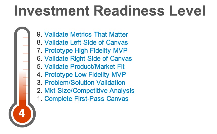


 Image: Flickr user


 JUAN
JUAN


